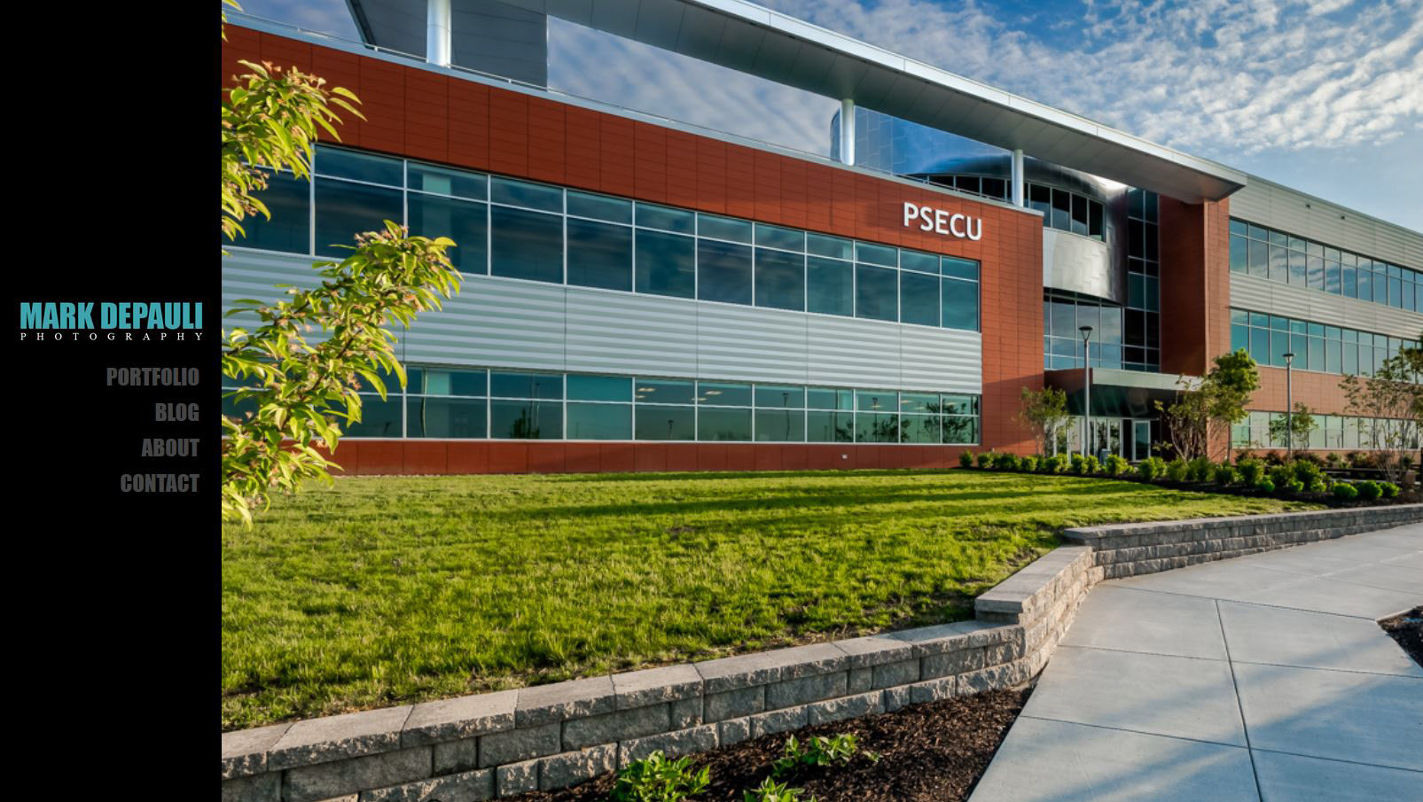
This is the list layout for the portfolio section. Toggles from the grid layout.
The is the layout for individual blog articles. A script extracts the images from the blog post, and lists them on the right, with the content to the left. This works ok, but I have some tweaking to do. Perhaps a have the images float to the center when there isn't any remaining text, to avoid an award gap.

